Validation of regression assumptions
regression.RmdThe R package pointapply contains the code and data to reconstruct the publication: Martin Schobben, Michiel Kienhuis, and Lubos Polerecky. 2021. New methods to detect isotopic heterogeneity with Secondary Ion Mass Spectrometry, preprint on Eartharxiv.
Introduction
The validity of inter- and intra-analysis isotope models is verified for the nanoSIMS-generated data by an assessment of the implicit assumptions of the linear regression model (Eq. (4) of the paper, and see below); normality, homogeneity and independence of residuals (see also vignette("IC-diagnostics", package = "point")).
\[\text{The ideal linear model:} \quad \hat{X}_i^b = \hat{R}X_i^a + \hat{e}_i \text{.}\]
In addition, the regression assumptions are used to aid the selection of the appropriate grid-cell size, as the underlying data structure of ion counts depends on this factor encompassed in the individual measurements of a conventional SIMS isotope analysis. In effect, the smaller the grid-cell (i.e. measurement time) the more the reduced counts will deviate from a normal (Gaussian distribution). This effect will affect at first counts of the rare isotope (i.e. 13C).
The function to perform regression diagnostics diag_R() is a core feature of the accompanying package point (Schobben 2022).
library(point) # regression diagnostics
library(pointapply) # this paper
Download data
The validation of regression assumptions of Supplementary Section requires ion count data processed with the point R package. Information on how to generate processed data from raw data can be found in the vignette Reading matlab files (vignette("data")). Alternatively, processed data can be downloaded from Zenodo with the function download_point().
# use download_point() to obtain processed data (only has to be done once)
download_point(type = "processed")
Load data
For this example processed data is loaded with different grid-cell sizes to gauge the effect of cell-size on the underlying data structure and its effect on the validity of the linear regression model. In the study grid-cell size of 4, 8, 16, 32, 64, 128 pixels for one side of the square cell.
library(purrr)
library(rlang)
library(dplyr)

# grid-cell sizes
grid_cell <- sapply(2:7, function(x) 2 ^ x)
# names of the analytes in the paper
name <- c("MEX", "MON")
# load
name <- load_point("map_sum_grid", name, grid_cell, return_name = TRUE)
# data frame aggregated over depth
tb <- map_dfr(syms(name), ~filter(eval(.x), .data$dim_name.nm == "depth"))
Regression diagnostics
Normality of residuals
The assumption of normality is tested on the studentized residuals (\(\hat{e}_i^*\)) of the ratio method regression model for 12C (independent) and 13C (dependent), see the paper and the documentation of the point package for more information. The diag_R() with the .method = "QQ" generates sample quantiles and theoretical quantiles (and the predicted quantiles together with a standard error) as well as performing an Anderson-Darling hypothesis test (by selecting: .hyp = "norm") with the null hypothesis \(H_0\) of normality for \(\hat{e}_i^*\).
Note that these analysis can take a while to execute, but the execution can be speed up by parallel execution. This can be achieved by setting .mc_cores to a number that is available on your machine. This option is, however, not avalaible for Windows.
tb_QQ <- diag_R(tb, "13C", "12C", file.nm, sample.nm, grid_size.nm, grid.nm,
                .method = "QQ", .hyp = "norm", .output = "diagnostics",
                .mc_cores = 4)
Residuals with a mean of zero
For the next chunk of code, only the argument .hyp is changed to "ttest". This invokes another hypothesis test, which checks whether the mean of the pooled \(\hat{e}_i^*\) is significantly different from zero by performing a one-sample two-sided Student’s t hypothesis test.
tb_mu <- diag_R(tb, "13C", "12C", file.nm, sample.nm,  grid_size.nm, grid.nm,
                .method = "QQ", .hyp = "ttest", .output = "diagnostics",
                .mc_cores = 4)
Constant variance
Patterns in the homogeneity of \(\hat{e}_i^*\) are another diagnostic feature for the validity of the regression model. The diag_R() function with argument .method = "CV" provides the necessary building blocks for plotting a scale-location plot, where \(\hat{e}_i^*\) is plotted against the predicted value (here \(\hat{^{13}C}\)) to visualise potential patterns that can help assess whether a linear model is the most accurate representation of the sampled data. This is formalized in yet another hypothesis test; Breusch-Pagan test (here set by the argument .hyp = "bp"), which essentially plots a least square model on this location-scale plot. Again, check the paper and the documentation of the point package for more information on the function.
tb_CV <- diag_R(tb, "13C", "12C", file.nm, sample.nm, grid_size.nm, grid.nm,
                .method = "CV", .hyp = "bp", .output = "diagnostics",
                .mc_cores = 4)
Independence of residuals
The independence of the distributions, or autocorrelation among measurements, is checked by calculating the correlation of the series of \(\hat{e}_i^*\) with a time-lagged version of itself. This is done by setting the argument .method to "IR". Also, this can be cast in a hypothesis test. The diag_R() function applies as a Ljung-Box hypothesis test, where the time series is cross-validated with a time series without autocorrelation (“white noise”); the later forms the basis for the \(H_0\) of “no autocorrelation”.
tb_IR <- diag_R(tb, "13C", "12C", file.nm, sample.nm, grid_size.nm, grid.nm,
                .method = "IR", .hyp = "ljung", .output = "diagnostics",
                .mc_cores = 4)
Visualization
Classification plots
Barplots (ggplot with geom_bar()(Wickham et al. 2021; Wickham 2016)) are chosen to visualise (Supplementary Fig. 6), and summarise the outcomes of the different hypothesis tests for the different grid-cell sizes. Besides a bin selection based on grid-cell size, a secondary x-axis is added to further emphasize the importance of count statistics (Poisson statistics) on the underlying data structure, and thus a crucial aspects in the outcome of various hypothesis tests. For this the mean count of the rare isotope (13C) is calculated for both samples added together and for each grid-cell size separately.
# mean ion counts for grid-cell sizes
vc_N_13C <- group_by(tb, grid_size.nm, species.nm) %>%
  summarise(N = mean(N.pr), .groups = "drop") %>%
  filter(species.nm == "13C")
The function hyp_class() constructs barplots showing the frequency of \(H_0\) rejection for the various hypothesis tests.
QQ_class <- hyp_class(tb_QQ, vc_N_13C, "Normality test", save = TRUE) # barplot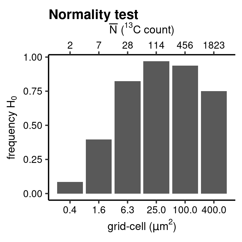
Anderson-Darling normality test.
CV_class <- hyp_class(tb_CV, vc_N_13C, "Breusch-Pagan test", save = TRUE) # barplot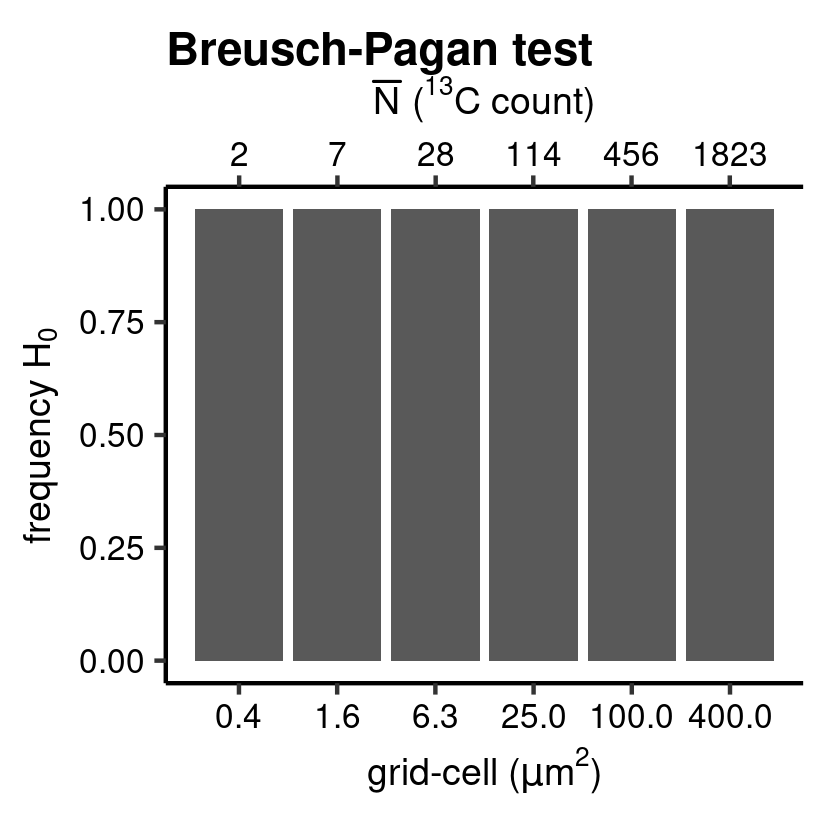
Breusch-Pagan test.
mu_class <- hyp_class(tb_mu, vc_N_13C, "Student's t test", save = TRUE) # barplot 
Student’s t test.
IR_class <- hyp_class(tb_IR, vc_N_13C, "Ljung-box test", save = TRUE) # barplot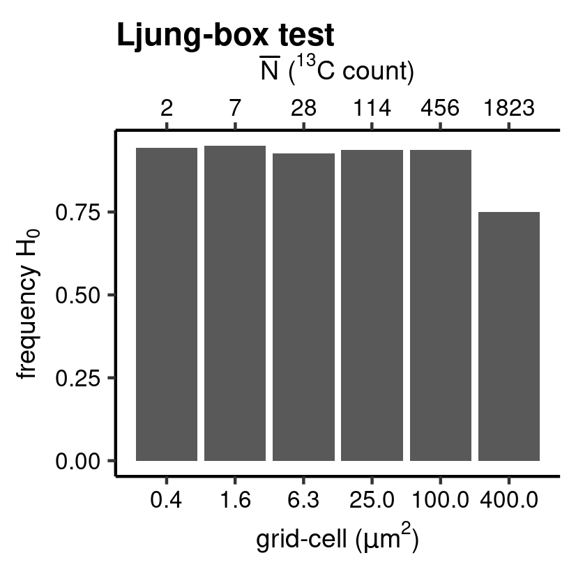
Ljung-box test.
Scatterplots
The results of the regression diagnostics are furthermore evaluated by visualising the normality of the pooled \(\hat{e}_i^*\) as a normal Quantile–Quantile plot (Supplementary Fig. 4) and homogeneity of variance as a scale-location plot (Supplementary Fig. 5). Because of the high number of ion counts in a standard SIMS measurement, the 2D-density of the data (i.e. how many data point fall in a specific regions on the x-y coordinates of the plot) is highlighted by mapping of color and alpha to the individual points for a better visualization of patterns. This is achieved with the function gg_dens() which produces a ggplot (Wickham et al. 2021; Wickham 2016) with geom_point() and calculates the 2D density of each observation with the function MASS::kde2d()(Ripley 2022; Venables and Ripley 2002), and which is included in the function point::twodens().
Normal Quantile–Quantile plot
library(ggplot2)

QQ_dens <- gg_dens(
  tb_QQ,
  TQ,
  RQ,
  "Theoretical quantiles",
  "Sample quantiles",
  "Normal QQ plot",
  grid_size.nm,
  1,
  c(-4, 4),
  c(-4, 4),
  unit = "um"
)

# add abline
QQ_dens <- QQ_dens + geom_abline(alpha = 0.7, linetype = 3)
# plot and save for paper
save_point(QQ_dens, name = "point_QQ", width = 15, height = 10, unit = "cm")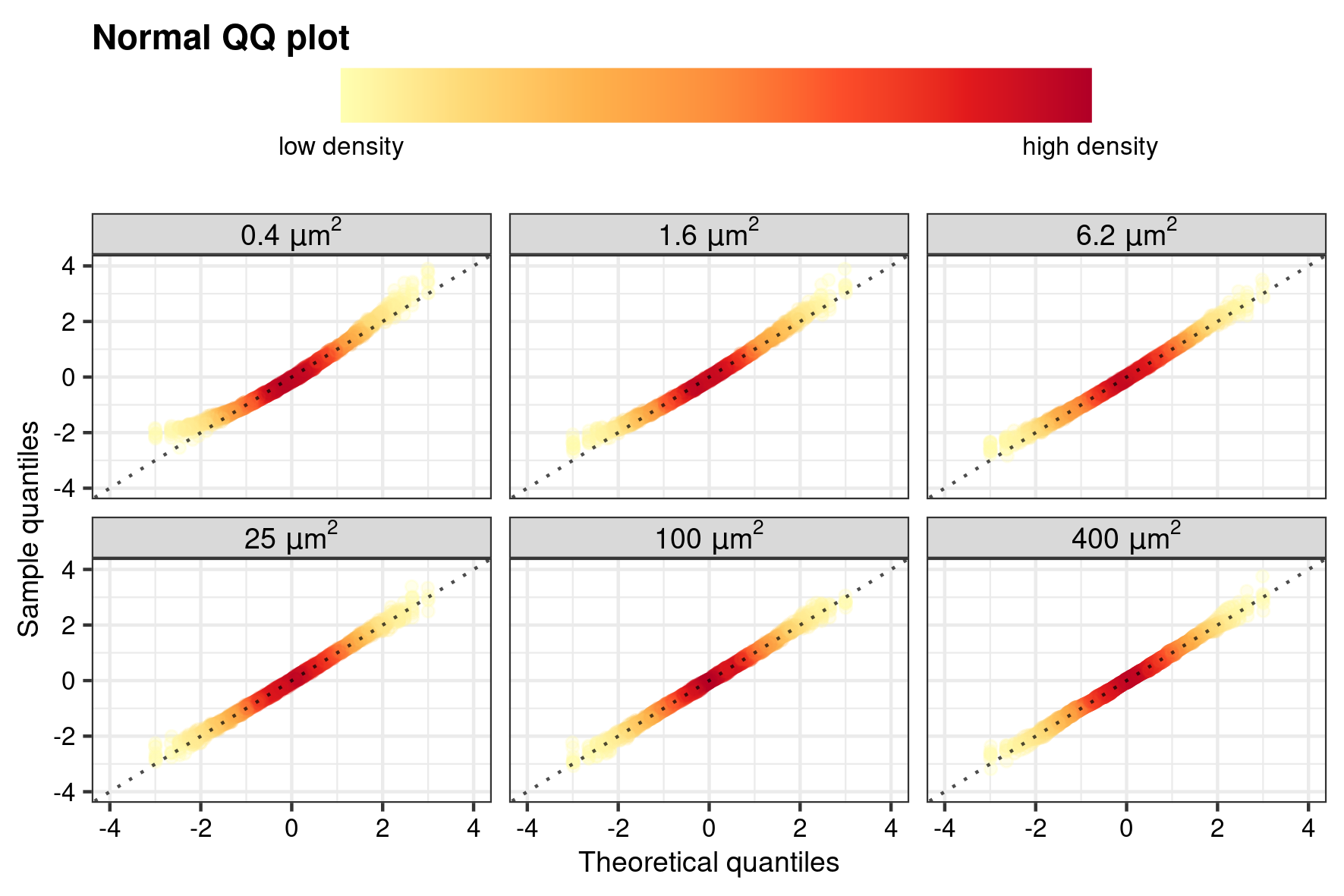
Quantile–Quantile normality plot
Scale–location plot
CV_dens <- gg_dens(
  tb_CV,
  hat_Xt.pr.13C,
  studE,
  substitute(
    "fitted value (" * hat(a) * ")",
    list(a = point::ion_labeller("13C", "expr"))
    ),
  expression("studentized residuals (" * italic(e)^"*" * ")"),
  "Scale-location plot",
  grid_size.nm,
  1,
  facet_sc = "free_x",
  unit = "um"
)
# add ab line
CV_dens <- CV_dens + geom_hline(yintercept = 0, linetype = 3)
# plot and save for paper
save_point(CV_dens, name = "point_CV", width = 15, height = 10, unit = "cm")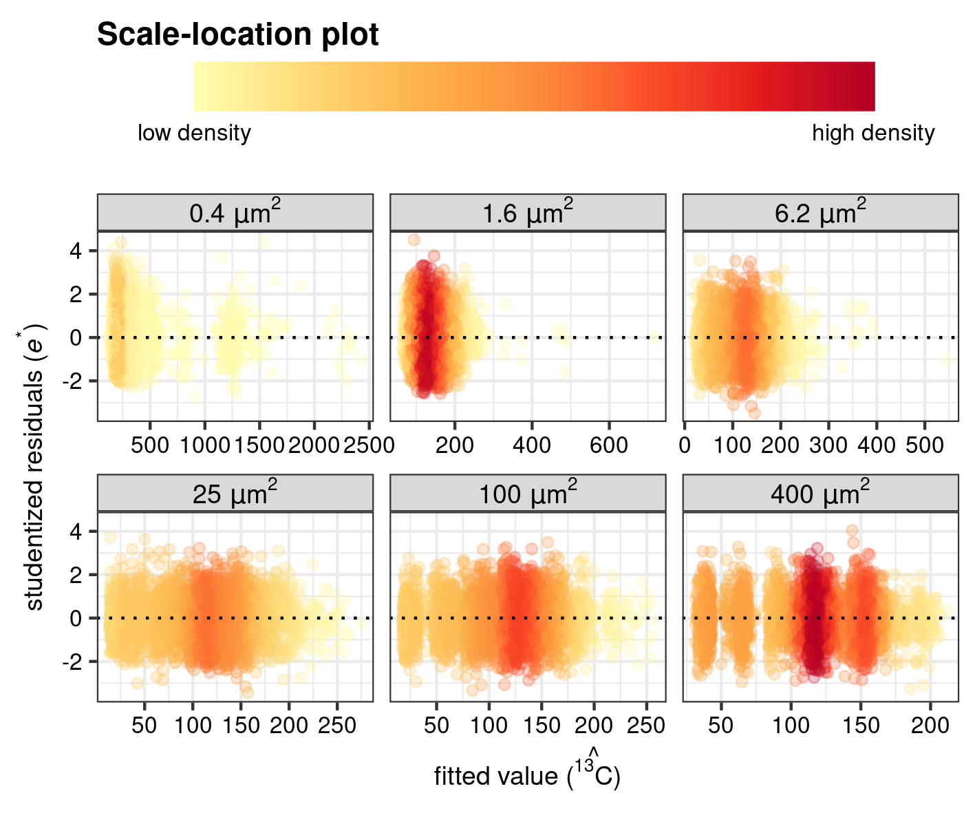
Scale–location plot
References
Ripley, Brian. 2022. MASS: Support Functions and Datasets for Venables and Ripley’s Mass. http://www.stats.ox.ac.uk/pub/MASS4/.
Schobben, Martin. 2022. Point: Reading, Processing, and Analysing Raw Ion Count Data. https://martinschobben.github.io/point/.
Venables, W. N., and B. D. Ripley. 2002. Modern Applied Statistics with S. Fourth. New York: Springer. https://www.stats.ox.ac.uk/pub/MASS4/.
Wickham, Hadley. 2016. Ggplot2: Elegant Graphics for Data Analysis. Springer-Verlag New York. https://ggplot2.tidyverse.org.
Wickham, Hadley, Winston Chang, Lionel Henry, Thomas Lin Pedersen, Kohske Takahashi, Claus Wilke, Kara Woo, Hiroaki Yutani, and Dewey Dunnington. 2021. Ggplot2: Create Elegant Data Visualisations Using the Grammar of Graphics. https://CRAN.R-project.org/package=ggplot2.