2. Exploratory data analysis
explore.Rmd
library(PAGES)Tidyverse packages
In the following exercise I will use the packages ggplot2 (Wickham et al. 2020; Wickham 2016) for plotting and dplyr (Wickham et al. 2021) for data manipulations. Both packages are from the tidyverse collection.
Data
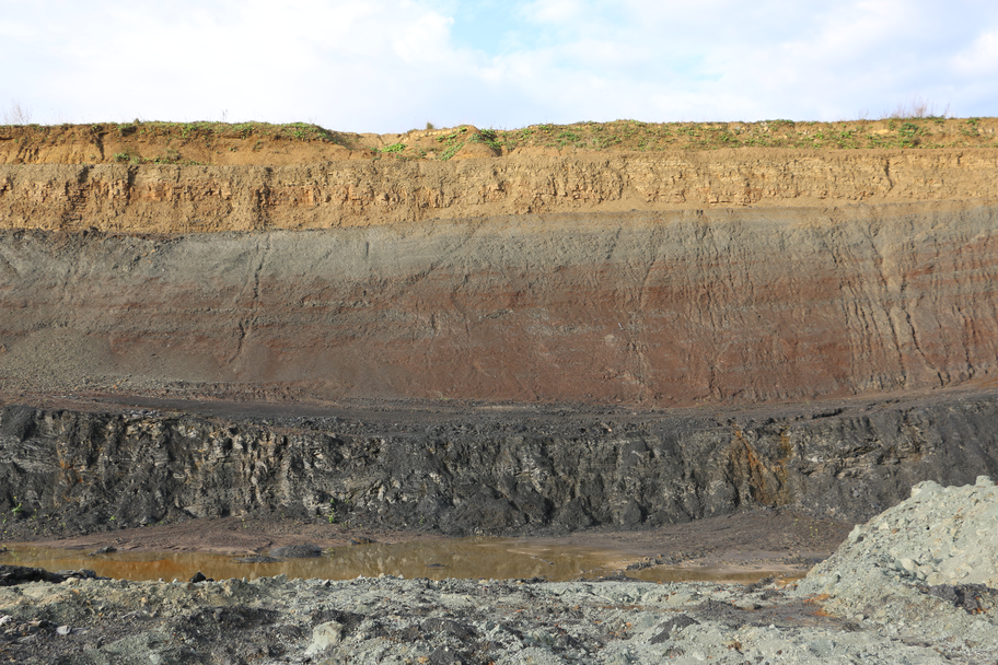
I will use for this example the palynological dataset of my 2019 study on the Triassic-Jurassic exposed at sites in Germany and Austria transition (Schobben et al. 2019).
Position and orientation
In this example, I will show how the options position and orientation of th geom_area() function is important for stratigraphic studies with palynological count data.
The following is listed in the manual for these arguments.
-
positionPosition adjustment, either as a string, or the result of a call to a position adjustment function. -
orientationThe orientation of the layer. The default (NA) automatically determines the orientation from the aesthetic mapping. In the rare event that this fails it can be given explicitly by settingorientationto either"x"or"y". See the Orientation section for more detail.
You will notice that I use a long format version of the Kuhjoch dataset (kuhjoch_long). This is not the format that you are normally used to. I will later on explain the transformation needed to obtain this type of data from the customary wide format data frame. The values of the variable count are absolute counts of the micro-floral elements found under the microscope. In the exercise, I will transform this to relative counts.
First, I split the dataset into two types of analyses with facet_grid() and the categorical value type supplied to the argument cols with the function vars(). Furthermore, I supply "y" to the argument orientation of geom_area() to ensure the correct direction of the lines drawn, which follows stratigraphic height. I keep the argument position first on the default setting "stack".
ggplot(data = kuhjoch_long, mapping = aes(x = count, y = height,  fill = label)) +
  geom_area(position = "stack", orientation = "y") +
  facet_grid(cols = vars(type))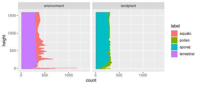
This produces a stratigraphic plot with absolute palynomorph counts and two stacked areas.
Transformation and position
The previous plot is not very useful, and we would rather use stacked areas and relative counts to get a sense of compositional changes in palynology with height or depth in a profile or core.
The position adjustment "fill" applies a transformation to the position of the elements within the geom_area() call. This stacks the areas but also transforms them, so that the total scales to 1 (or 100%). This is useful behaviour in the instance of palynological count data as we now can better see the compositional changes; e.g. spores vs. pollen and aquatic vs. terrestrial inputs.
ggplot(data = kuhjoch_long, mapping = aes(x = count, y = height,  fill = label)) +
  geom_area(position = "fill", orientation = "y") +
  facet_grid(cols = vars(type))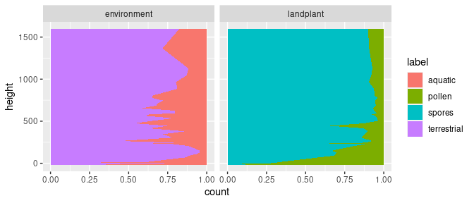
Manual transformation with dplyr
To exemplify what happens internally in the previous ggplot2 call, we can do the transformation outside of the call by applying group_by() and mutate() of the dplyr package directly to the data. Note, the change from the pipe (%>%) to the plus sign (+) in the ggplot call. The usage of the dplyr functions will be explained a little later in the presentation.
group_by(kuhjoch_long, height, type) %>%
  mutate(count = count / sum(count)) %>%
  ggplot(mapping = aes(x = count, y = height,  fill = label)) +
    geom_area(orientation = "y") +
    facet_grid(cols = vars(type))